What Is the Dark Romance Aesthetic?

I have been watching this aesthetic take over my feeds for about two years.
Then I started seeing the sales data. Romance print revenue up 24 percent. The #DarkRomance hashtag crossing 8 billion views on TikTok.
A genre that already drove a fifth of all adult fiction revenue accelerating rather than plateauing.
And a parallel market of digital products — journals, printables, short ebooks, branding kits for indie authors — expanding right alongside the books.
So I sat down and studied it properly. Here is what I found.
The visual grammar is more consistent than you think
What makes dark romance visually distinctive is not just that it is dark. It is that it is specific.
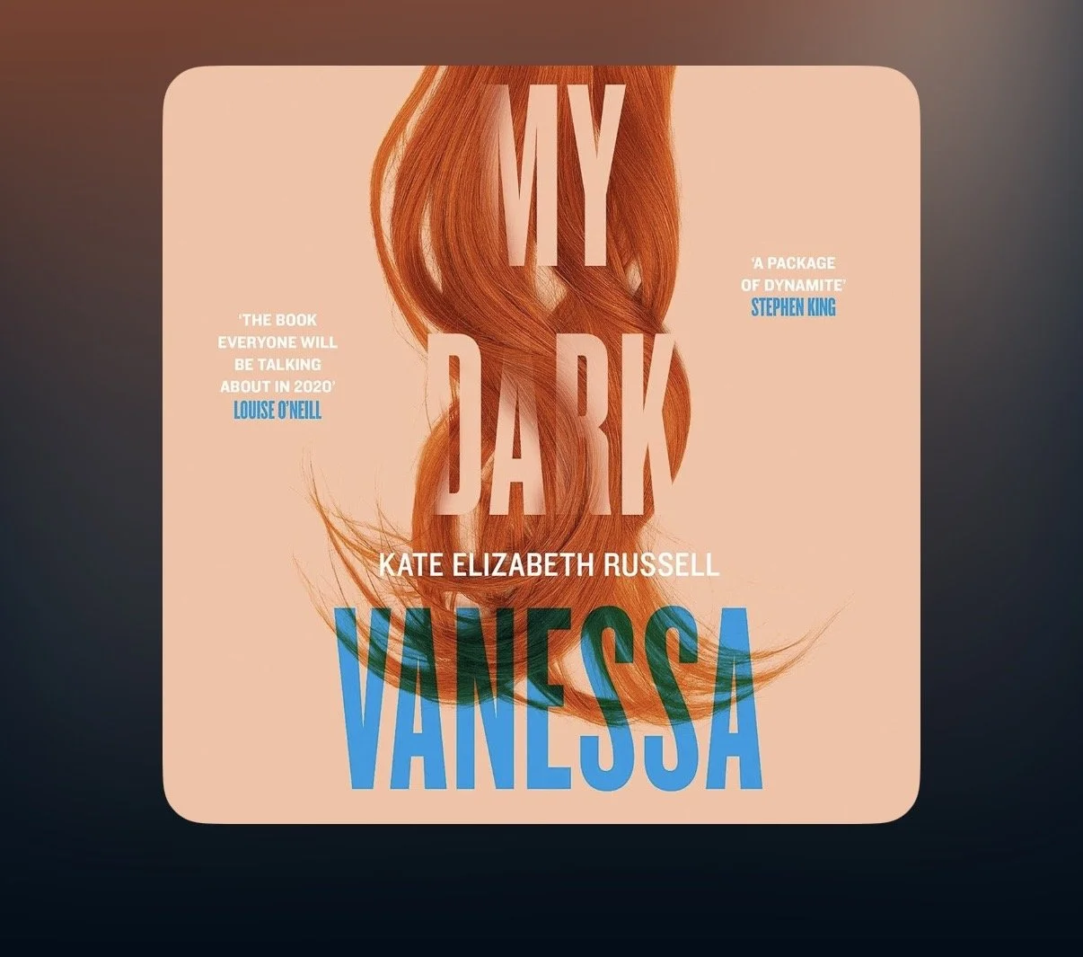
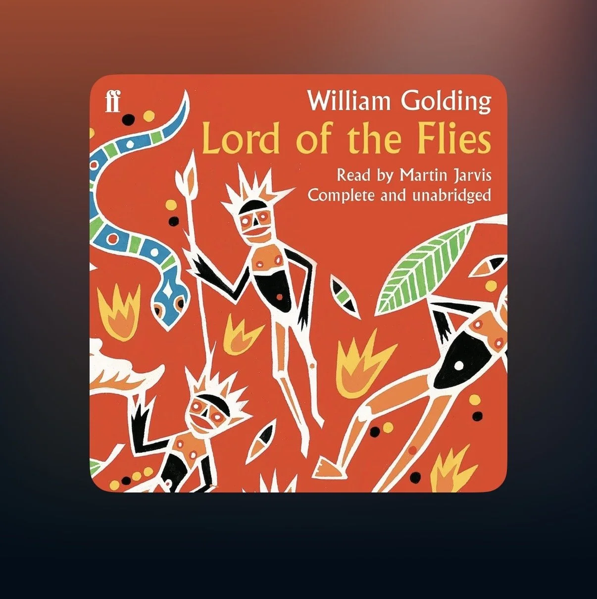
The palette runs on three pillars: near-black as the dominant background, deep crimson to burgundy for emotional emphasis, and antique gold for what functions as luxury-danger.
Everything else — plum for supernatural mystery, dusty rose for rare moments of softness — is secondary.
The typography favors high-contrast serif fonts with real authority to them: Playfair Display, Bodoni, Cinzel. Letter-spacing is tight.
Metallic texture on type (gold foil, silver) is the current high-signal choice. The motifs are codified: thorned roses above everything else, daggers, broken chains, partial human figures that show a jaw or a hand but never a full face.
That last detail matters. The partial figure is not laziness. It preserves mystery and allows the reader to project.
Dark romance covers and product imagery almost never show complete faces because the aesthetic is built on suggestion, not revelation.
The emotional contract is specific too
Being loved with absolute, terrifying intensity.
The hero who is ruthless to the world but protective of exactly one person is not a fantasy about abuse.
It is a fantasy about being irreplaceable, about someone whose devotion is so consuming it borders on a threat to everyone else.
This is why the morally gray hero works so consistently as a character type. His capacity for harm makes his gentleness feel hard-won and extraordinary.
The contrast does the emotional heavy lifting.
And the most significant character shift happening right now: readers are increasingly demanding that the heroine match that energy.
Co-conspirators, not damsels. Women who lie, manipulate, fight, and arrive at devotion as equals.
If you are writing dark romance and you are still defaulting to a passive female lead, you are writing for an audience that has already moved on.
What this creates for product sellers
The dark romance community has something most niches do not: a shared identity with public expression.
Readers talk about being a “dark romance girlie” with the same comfort that someone talks about being a Liverpool supporter.
They buy products that let them signal that identity — and they buy them repeatedly.
The highest-volume digital product category right now is the printable reading journal: spice ratings, trope trackers, book boyfriend pages.
Kindle inserts (decorative designs that slide between device and clear case) are the fastest-growing emerging category. Branded printable bundles, short trope-based ebooks, and author branding kits for indie writers round out the market.
The key design principle across all of these: apply the full aesthetic consistently. Dark backgrounds, gold headings, crimson accents, genre vocabulary in every label.
A single off-brand element — a bright color, a playful font, a tone that does not fit — disrupts the emotional contract the aesthetic makes with its audience. Consistency is not repetition here. It is trust.
If you are thinking about entering this space
Start with your visual foundation before you start with your product. Locked palette.
Font pairing. Three to five recurring motifs. A one-page brand reference you can return to for every piece you make.
Then make one thing. A reading journal. A short ebook around a single trope. A printable bundle. Apply the palette. Use the vocabulary.
Photograph your mockup against a dark background with candle props. Write your product description leading with trope signals rather than plot summary.